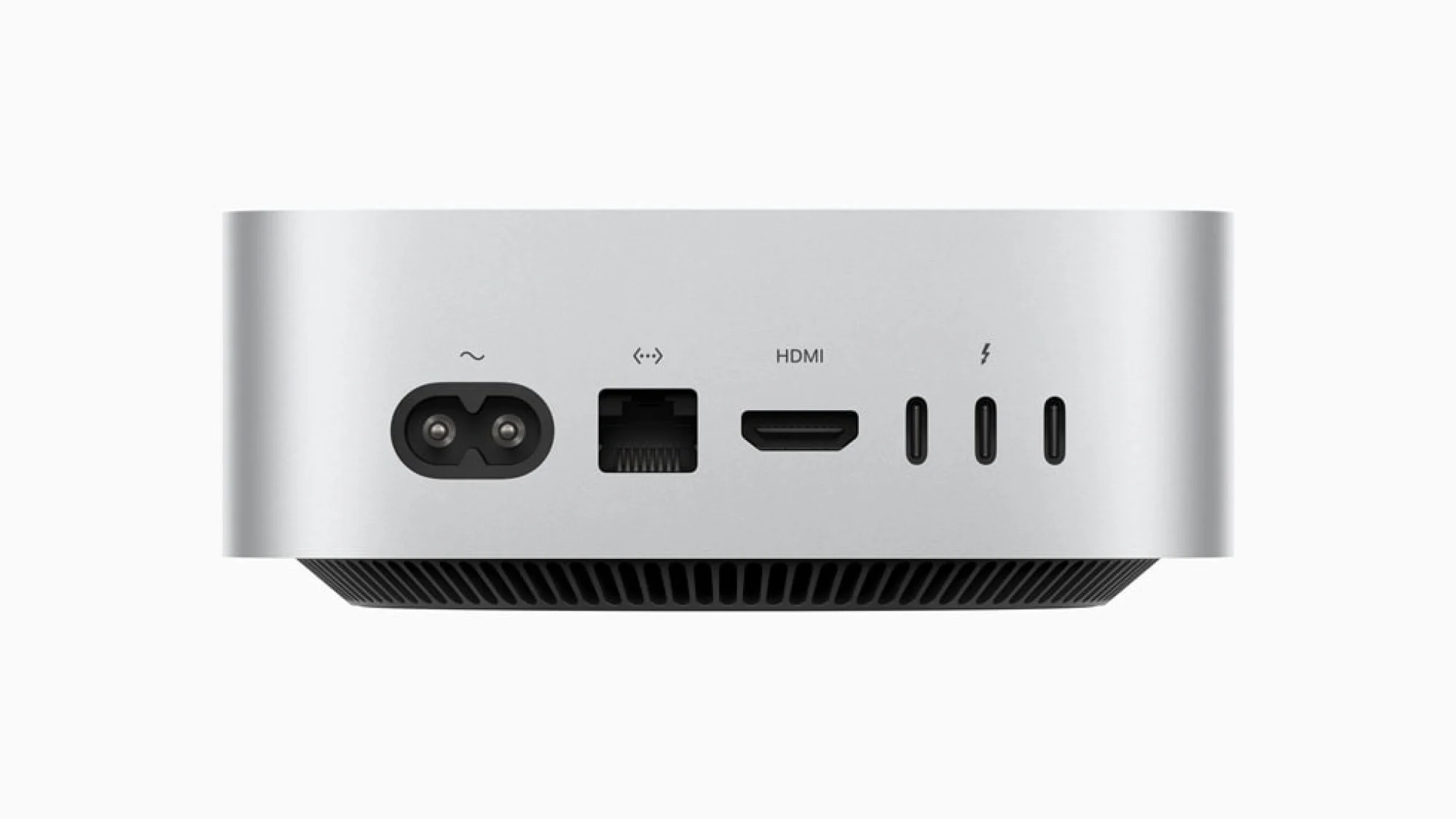
In October 2024, Apple unveiled a dramatically redesigned Mac mini, featuring the powerful M4 chip and a sleek, compact form factor. But amidst the excitement, one design choice sparked debate: the relocation of the power button to the underside of the device. This seemingly minor change left many users puzzled and even frustrated. Why would Apple “hide” such an essential button?
To address the controversy, Apple executives Greg Joswiak (Senior Vice President of Worldwide Marketing) and John Ternus (Senior Vice President of Hardware Engineering) sat down with IThome, a Chinese tech publication, to explain the reasoning behind this unconventional decision. Their explanation sheds light on Apple’s design philosophy and its focus on user experience, even if it means challenging conventions.
Shrinking the Mini: A Design Challenge
The 2024 Mac mini is significantly smaller than its predecessor, almost half the size. This miniaturization, while offering advantages in terms of desk space and portability, presented challenges for Apple’s designers. Every millimeter mattered, and finding optimal placements for all the ports and buttons became a complex puzzle.
“Honestly, most people almost never use the power button on a Mac,” Joswiak remarked during the interview. This observation, backed by user data, played a crucial role in the decision to relocate the power button. With features like “Hey Siri” and automatic wake-up on peripherals, the need to physically press the power button has diminished for many users.
The Underside: A Surprisingly Convenient Location?
While initially perplexing, Apple argues that the underside is actually a practical location for the power button. Ternus emphasized that despite its placement, the button remains easily accessible. Users can simply tuck a finger beneath the mini to press it.
This explanation, however, hasn’t entirely convinced everyone. Some users argue that accessing the button now requires lifting or tilting the device, which can be inconvenient, especially if the mini is placed in a tight space or connected to multiple peripherals.
My Take: A Bold Move with Trade-offs
As a long-time Mac user and tech enthusiast, I’ve always appreciated Apple’s attention to detail and user-centric design. While I initially found the new power button placement odd, I’ve come to appreciate the logic behind it.
In my own experience, I rarely use the power button on my Macs. With features like automatic wake and sleep, the power button often becomes redundant. However, there are times when I need to access it, such as during troubleshooting or when forcing a shutdown. In these instances, the new placement can be slightly less convenient.
Apple’s decision highlights a key aspect of design: trade-offs. To achieve a smaller form factor, certain compromises had to be made. Whether the trade-off in this case is justified depends on individual user preferences and usage patterns.
A Deeper Dive into the Redesign
Beyond the power button placement, the 2024 Mac mini boasts several noteworthy design changes:
- Reduced Footprint: The most striking change is the mini’s dramatically reduced size. It’s now incredibly compact, making it ideal for small desks or home entertainment setups.
- Enhanced Connectivity: Despite its smaller size, the new mini offers improved connectivity, with a range of ports including Thunderbolt 4, HDMI, and Ethernet.
- M4 Chip: The inclusion of Apple’s latest M4 chip delivers a significant performance boost, making the mini capable of handling demanding tasks like video editing and software development.
- Sleek Aesthetics: The mini retains its minimalist aesthetic, with an aluminum enclosure and a clean, modern design.
Addressing User Concerns
While the relocated power button has been the most discussed design change, some users have also raised concerns about other aspects of the redesign:
- Lack of Upgradability: Like its predecessors, the 2024 Mac mini has soldered RAM and storage, limiting its upgradability. This can be a concern for users who require more memory or storage down the line.
- Price: The new mini comes with a higher starting price compared to the previous generation. While the performance gains justify the increase to some extent, it may deter budget-conscious buyers.
The Future of the Mac Mini
Despite the initial controversy and some valid concerns, the 2024 Mac mini represents a significant step forward for Apple’s compact desktop line. Its powerful performance, sleek design, and enhanced connectivity make it a compelling choice for a wide range of users.
It remains to be seen how users will ultimately adapt to the new power button placement. Perhaps it will become a non-issue as users become accustomed to the redesigned device. Or maybe Apple will revisit the design in future iterations based on user feedback.
One thing is certain: Apple’s willingness to challenge conventions and push the boundaries of design will continue to shape the future of its products, even if it means sparking a few debates along the way.